



Although Artificial Intelligence (AI) is a tremendous source of inspiration in the design world, it still requires the "human touch" and technical discipline when it comes to professional branding. Our recently completed Yıldızbey project is a great case study showing how pixelated outputs from platforms like Gemini are transformed into a high-standard brand identity.
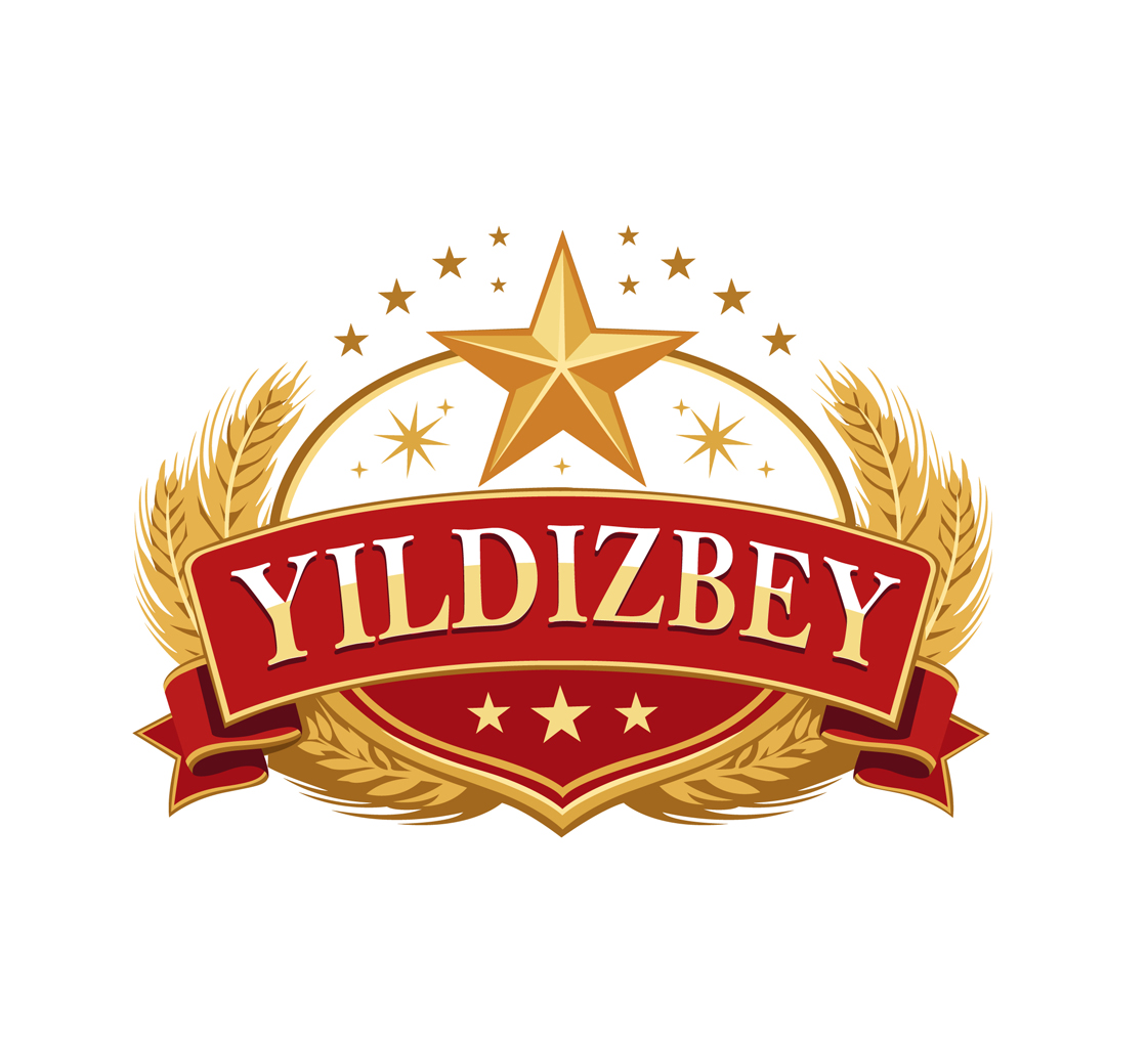
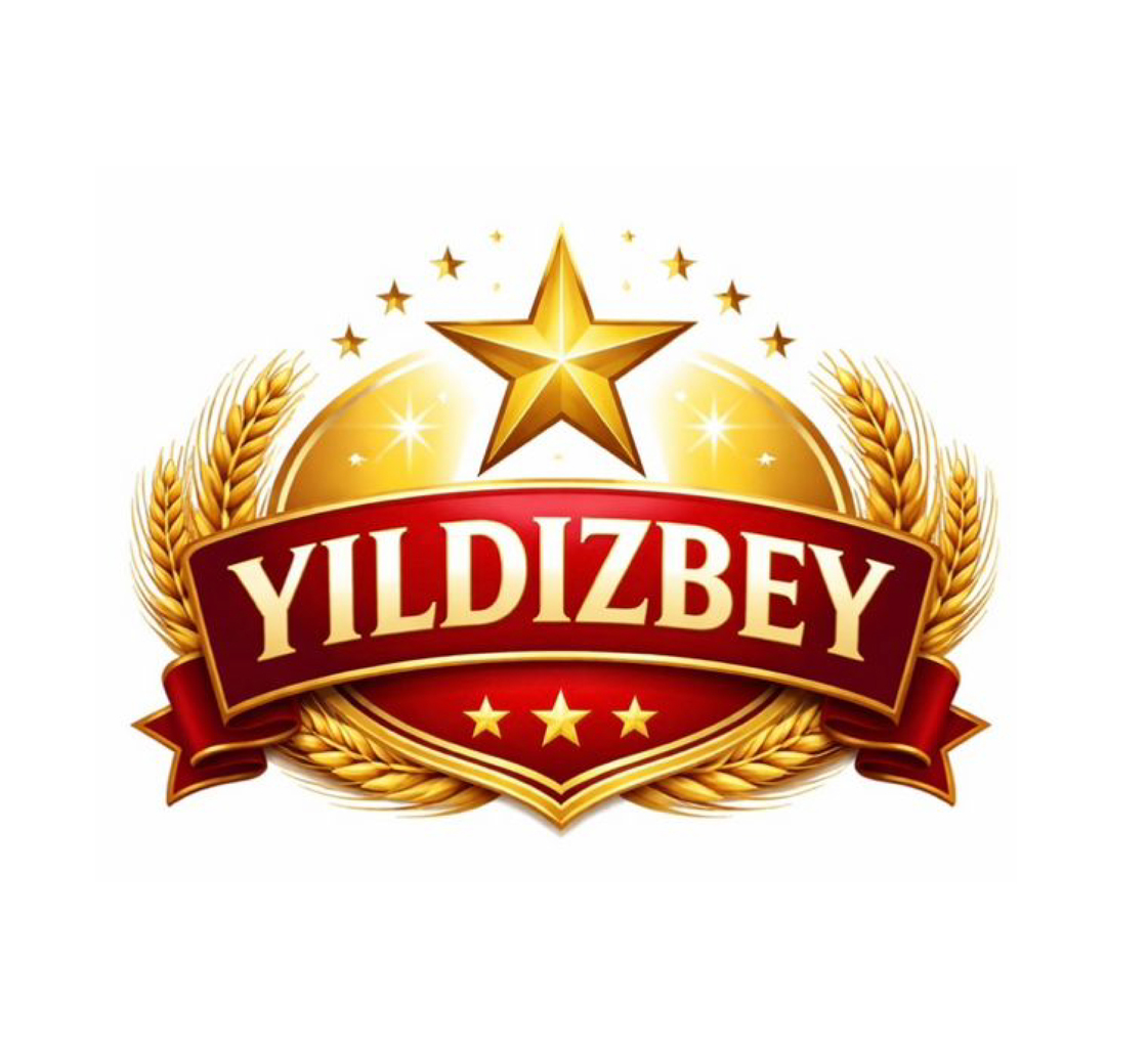
AI Output vs. Real Design: What's the Problem?
Our client Yıldızbey had a logo whose outlines were generated using AI. However, technically, this visual wasn't a logo; it was actually a complex "illustration." It contained too many uncontrolled color transitions, messy details, and a pixelated structure that was impossible to apply in professional printing processes (signage, packaging, textile printing). It was far from the most fundamental rule of a logo: being "Simple, Memorable, and Scalable."
The WeGraf Operation: Simplification and Perfection
When starting the project, we stayed 100% true to the original concept and our client's brand vision, but we applied professional branding criteria:
- Reduced the Number of Colors: We narrowed down the hundreds of random gradient mid-tones provided by the AI to a limited core spot color palette that represents the weight of the brand. This ensures color consistency and lowers production costs across all print types.
- Reformed the Graphic Shapes: We updated the "noisy" and asymmetrical details generated by the system with geometrically flawless, clean, and crisp graphic shapes.
- Manual Vector Tracing: We redrew the logo from scratch, calculating every single node one by one, rather than using automated conversion software. Now, whether this logo is printed as small as a pen or wrapped around a building, it will never lose its sharpness.
The Result: A Print-Ready Brand
Yıldızbey is no longer just an "AI idea"; it possesses a professional logo with infinite resolution (SVG, AI, PDF) that speaks the language of the printing press. Remember: AI generates, WeGraf perfects.